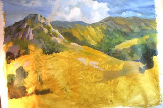
The human eye and mind likes areas of interest, and they also like a hierarchy of interest. Too much the same throughout the painting, and it becomes boring. If we keep areas of interest subordinate and dominate to one another, we create a subtle tension for the viewer to enjoy.
Here's a second exercise. Turn your head on its side and look at the painting from that angle. Got it? See how you can now easily discern the distance put into the further range of mountains by lightening and the softening of the edges? One doesn't notice this when it is seen "ordinarily", because we are so conditioned to see things this way--we aren't even conscious of it.
I lightened the distant range of mountains to make them lay down for you. (Nice doggie.) The nearmost rocks have a greater contrast of values. As I paint the close-up vegetation, the contrast between light and dark will increase, as well as the intensity of the colors.
No comments:
Post a Comment