Saturday, July 08, 2006

July 8 - Gallery Show Opening

Tonight was the opening of the Summer Art Show at the Santa Rosa   Plateau Visitors' Center, and I thought you would enjoy some images  from that opening. It was crowded, sales were good, and there were 14  other artists showing their work on the walls and room dividers. I  spent time talking to my friends and collectors, (that's Gabriel  Baber with me in two of the images) and thoroughly enjoyed the  evening. I had several paintings on display, and the invitation  painting is the big one behind me in the upper left and left side of  the image. This show benefits the Foundation, charged with finding  funds to provide transportation for every third grader to come up to  the Plateau from every elementary school within fifty miles.  Fun  evening, but no new painting. I hope you enjoy this look into the  
artist's life.

Thursday, July 06, 2006

July 7 - Summer Aspens


I had been talking on the phone with the curator of the show at the Santa Rosa Plateau (yes, Rob, that's what you are!), and mentioned a planned visit to the White Mountains of Arizona perhaps in August.  I love the mountains, and that conversation planted the seeds of this quick 6 x 6 canvas of backlit summer aspens.  I certainly hope there is a little trip to see them and paint from life this summer.  If not, I'll still see them in October when they turn.
Loads of paint and brushwork on this one. $125

July 6 - Washing Up at Del Mar Race Track


Sometimes a painting will tell me how big it needs to be.  This was the case today, when I pulled out a 6 x 4 inch canvas, and then sorted through some of the un-filed photo references to pick something to brighten your day.  A couple of photos of this girl washing "her favorite racehorse" at Del Mar caught my eye, and so I composited it up into a quick design.  It wouldn't cooperate and fit into a rectangle. And the power of the structure of the painting wouldn't lend itself to a small format of only six inches.  Take a look at the lines and movement of the structure, and think about where your eye goes as it wanders over the canvas.  Each part is designed to carry your eye on a journey. Even the two buckets need to be there.
 So to solve my dilemma about size, I retrieved a canvas from my "paint over them before they see the light of day" pile and brought this one to life on a 12 x 12 inch box canvas.  When I paint over a canvas, I always paint thickly, and never over one that has a final varnish.  It was with a sigh of relief that I obliterated a cute palm tree with a coconut wrapped like a present.  You don't want to go there, trust me!
  Join with me tonight as I raise a glass of wine to honor the sacrifice of a bad painting, and to celebrate with you the birth of a better one.  
  12 x 12 inches, on gallery-wrap (no framing needed) and I'm enjoying the painting of human figures these few days.  $400

Wednesday, July 05, 2006

July 5 - Beach Babes


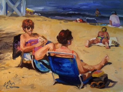
"Beach Babes"  I just love this daily painting!  Why?  First and foremost, it has good, solid design.  Second, it is a fun painting.  There are SO many possible stories to entertain the viewer.  It gives everyone, from the gossip to the voyeur, something to appeal to the senses.  I took the reference photos for this a few years ago when I was out at Catalina Island (you know, the one off the coast of California, "Twenty-six miles across the sea.").  People were lounging on the sand, and playing in the harbor water.  The design on this one is strong and interdependent.  Put your fingers over any one figure or item in the composition, and you'll see what I mean; it just weakens the painting.  Most reference shots you take are never as well designed as what the artist can do with their skills.
  Beach scenes also give me an opportunity to really pull out the stops on color.  Beachwear is bright and generally has a ton of pure color.  For this painting, I resurrected one of my favorite Classsic Oils, Platinum Violet.  You'll see it in the bathing suits and the shadow on the distant man's tee shirt.  
  Although this one isn't a lesson painting, there is much to learn from it.  
  A 12 x 16 oil, it is available for $400.

Tuesday, July 04, 2006

July 4 - Lesson Painting Finished!


"Keeping Cool" a 12 x 16 demonstration painting for the daily painting group, now finished. Contrast this with the July 3 work, and you'll see how much has been detailed out and adjusted to give your eye something to enjoy in every part of the canvas. There are small areas of rest for the eyes, like the upper right bluish corner, and the larger tree leaves above the riders, but the rest of the canyon and stream area are full of visual brushwork excitement.
Note the use of the warm thalo blue on the jeans (nowhere else) to bring your eye to the figures, and the use of alizarin in the light shirt of the left rider. This is intentional, to bring you to the focal point. The flashes of ultramarine blue and white in the lower right and on the left of the riders are "hop scotch spots" for your eye to travel through the painting. I bet you can find more!
You'll see that I haven't strayed far from the original rough structure, which still holds up, even though the layers on top and brushwork have made the structure less important. You can easily see it by squinting your eyes almost closed. That abstract structure really, REALLY matters!

Monday, July 03, 2006

July 3 - Lesson Painting Continued


Remember I said that working on the mid-values is a step to making a good painting better? The mid values are my largest area of the canvas, and those middle values play subordinate rolls to both the darks and especially the lights. In this image (bluish glare on upper right, sorry) you can see that I have taken the larger areas laid in, and made each of them more interesting to the viewer, without leaving the value range of that area. "Embellishing the big shapes".
This part of the painting process takes about as long as the final details--I just use bigger brushes! When I eventually DO get to the details of the water and the two riders, I'll use smaller brushes, and more pure color. I will also break the rules on warm/cool, putting some warms in the shadowed figures to really make them jump out at you. The reason I choose to do this is the figures are also middle value, and I have to contrast them from the major part of the painting, and I can only use purity of color and/or switching the palettes (using warm in a shadowed area) to really catch your eye.

Sunday, July 02, 2006

July 2 - Second Day of Lesson Painting


Second "mental mindset" of the process of painting begins with the laying in of the middle values.  This painting will be slightly below mid-key, which means there will be a dominance (in area) of middle values; a slightly smaller area of darks, and then the littlest area (square inches) composed of the light values.  Since I'm aware of this going in, I can spend a goodly amount of time working on variances within the middle value range to create interest in these non-focal-point areas.  The theory about balance of values comes directly from Edgar Whitney, an American watercolorist and extraordinary teacher who wrote a book on painting. Most of the book is about designing good paintings, and I've adopted his "Mama, Papa, Baby" balancing of values as explained above, to my work.  He talks about six value plans, that have proven to be most desirous on our eyes, and which make good paintings for collectors. 

So these middle values are being embelished and made interesting before I even begin to paint the focal points.  They of course will be subordinate to the final brush strokes.  I'm using my Color System palette, staying with warms in the sunlight and cools in the shadows and grayed colors everywhere.  Why? Because grayed colors pause the eye, and allow the viewer to "get" more out of the painting.  I can remember standing in front of a Leslie Humphrey oil a year ago and just in awe of her mastery of grays.  The only semi-pure color in the piece was in the tail of the horse going over the brush.  I understood what she did with that painting, and how masterful it is.  Most artists don't mix good grays, so their work doesn't captivate the viewer.