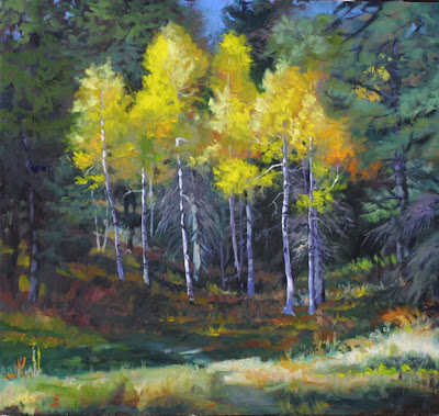
 I got back to this one last night, and am glad I did. Jury duty didn't last but a couple of hours, once they said they needed people for 18 days and I told them I was self-employed, an educator and a consultant. I don't mind jury service--especially since they have free wifi in the courts, but three weeks out of my life would definitely impact my painting, lessons, and my teaching!
So, for teaching, let's get to it. Can you see from my prior post how many of those "fuzzy" edges have been found again? The artist's choice of which edges to leave soft (aka "transitional") and those that are regained to a hard status is what makes an artist's work unique. If you're not already familiar with John Singer Sargent's paintings, please go Google image him, and study his masterful use of brush strokes to lead and define the composition of his work. Wow. What a mentor for those of us looking to see edges handled by a master. And of course, there is the living legend in Richard Schmid, who reigns King of the Edges. He has a web site. But don't go away to it just yet.
In starting with the reference photo of the aspens, we artists have to make choices. If we paint to the photograph too closely, what we do is take that "match" for the fire of our creativity, and it is still a match when we're done. If we use that match (photo reference) as the starting point for our work, then the canvas can come ablaze under our hand. I did not stick with the reference photograph provided, but changed and bent the design to make what I hope is a better statement. One plein air artist I know put it well, "If you paint just what you see, you may not get good design in your paintings. God was planting bushes. You, the artist, might need to move a few to get a good design."
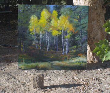
I've been asked, "Elin, how do you get such good images of your paintings?" So I offer the image below to answer that question. This was the image that became the one above. I take my work out into morning sunlight (not in shadow or under the eaves as some people would have you do.) I lean it up against something, and this is VERY important--with the canvas tilted about 12-15 degrees off of true 90 degrees to the sun. We visual artists need to SEE this, so look at the rock I put in the foreground, and see how the shadow isn't quite parallel to the bottom of the canvas, but "leans" a bit toward it. No glare, GREAT color, and true values.
Also note that the edges of the canvas are parallel to the sides of the image. That's very important if you don't want to learn how to "skew" and "distort" in photo editing programs. I know how, but prefer an easier path, so line up my sides of the work with the sides of the viewfinder.

My camera is a Canon digital, an ancient D30, but I also get great images with my newer Canon PowerShot A590. I've found it's not the camera, but the angle and sunlight that make the difference. Of course, I always photograph work without frames or glass.
You can see my entire blog here.
Color System information can be found HERE.
If you need to email me directly, please click here.
No comments:
Post a Comment