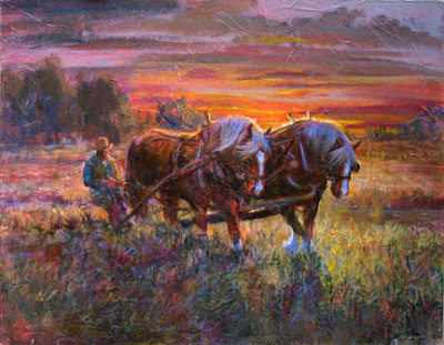
 While working on inventorying my collection, Alberto discovered one that has not been on the web site, and whick I've used over the past couple years to experiment using those handmade papers. Here it is, a 24 x 30 of draft horses in backlighting. The handmade papers create the overall texture on this one, and in this version it is decent, if not ground shaking.
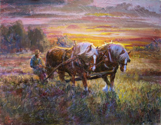
 Now I've taken it into Photoshop and done some color management, seeing what it looks like with some color shifts. In this version, I played down the color intensities, and shifted the colors over to the grayer side. Do you like this one better?

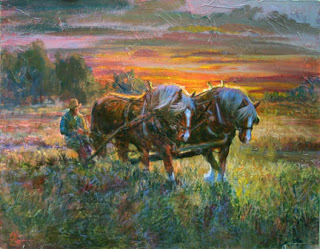
Then I shifted it over to the greener side, which makes more of a summer morning out of it. I kept the sky colors intact for the most part. Maybe you prefer these colors?

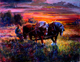
But that was not the finish. I decided that I needed more drama and contrast, so again I Photoshopped the image and punched it up as another experiment. Maybe this one appeals to the majority? In any event, Photoshop or its equivalent can allow you as it does me, to experiment and see what possible directions to go in with a work in progress!

You can see the entire blog here.
If you need to email me directly, please click here.
2 comments:
go green
Actually prefer less color intensity.
Post a Comment